
FLOW STATE
Website development, visual style & promo material design for local snowboard shop.

The brief
Flow State is a snowboard shop that focusses on personal advise.
They already had a great logo, which we definitely wanted to keep in place.
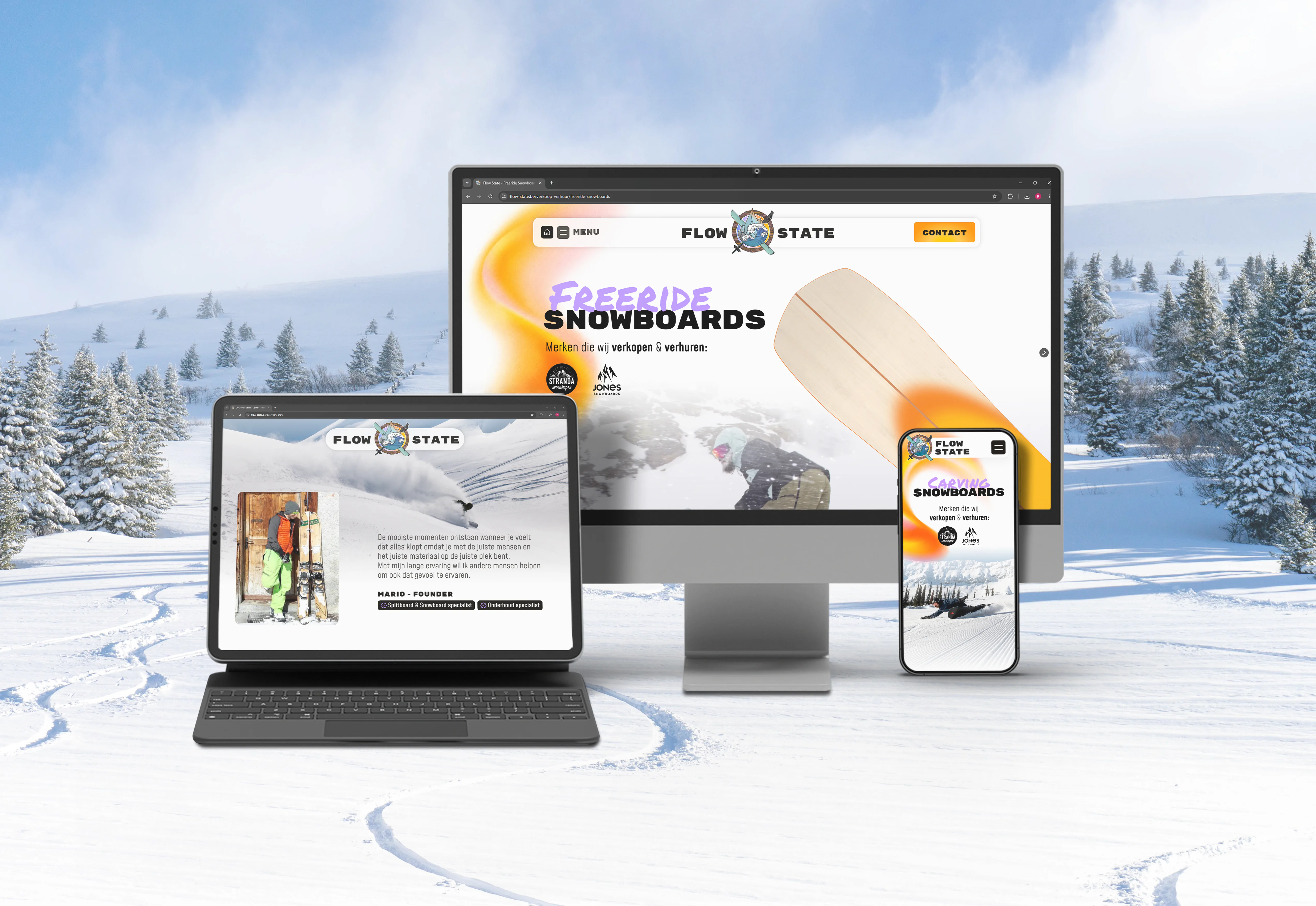
The main problem was an old website that lacked clear structure and felt outdated.
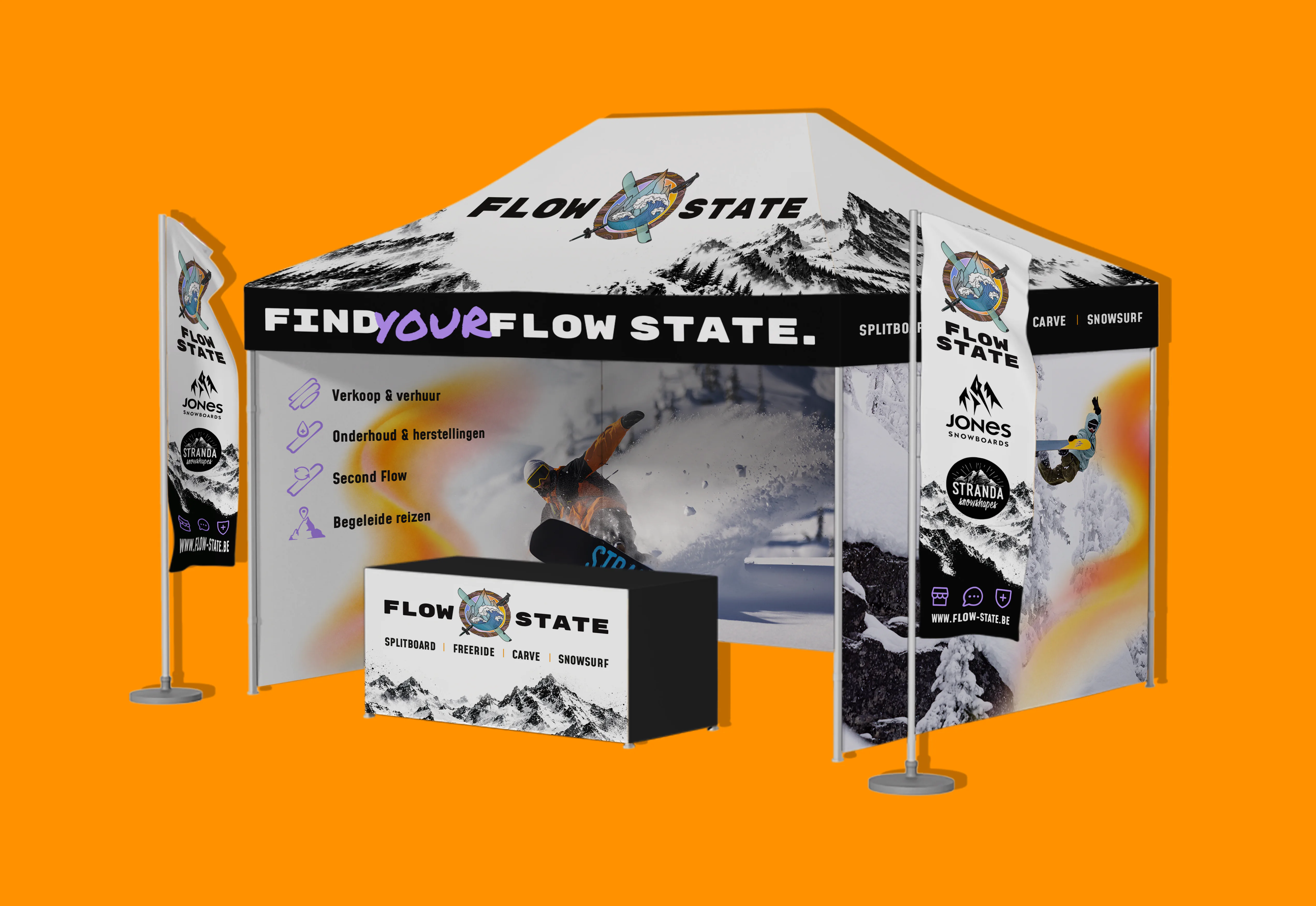
They also needed more visual presence for both the shop and for their annual snowboard testing and workshop event.
THE PRODUCTION
Brandstoked approached this project as more than just a website update.
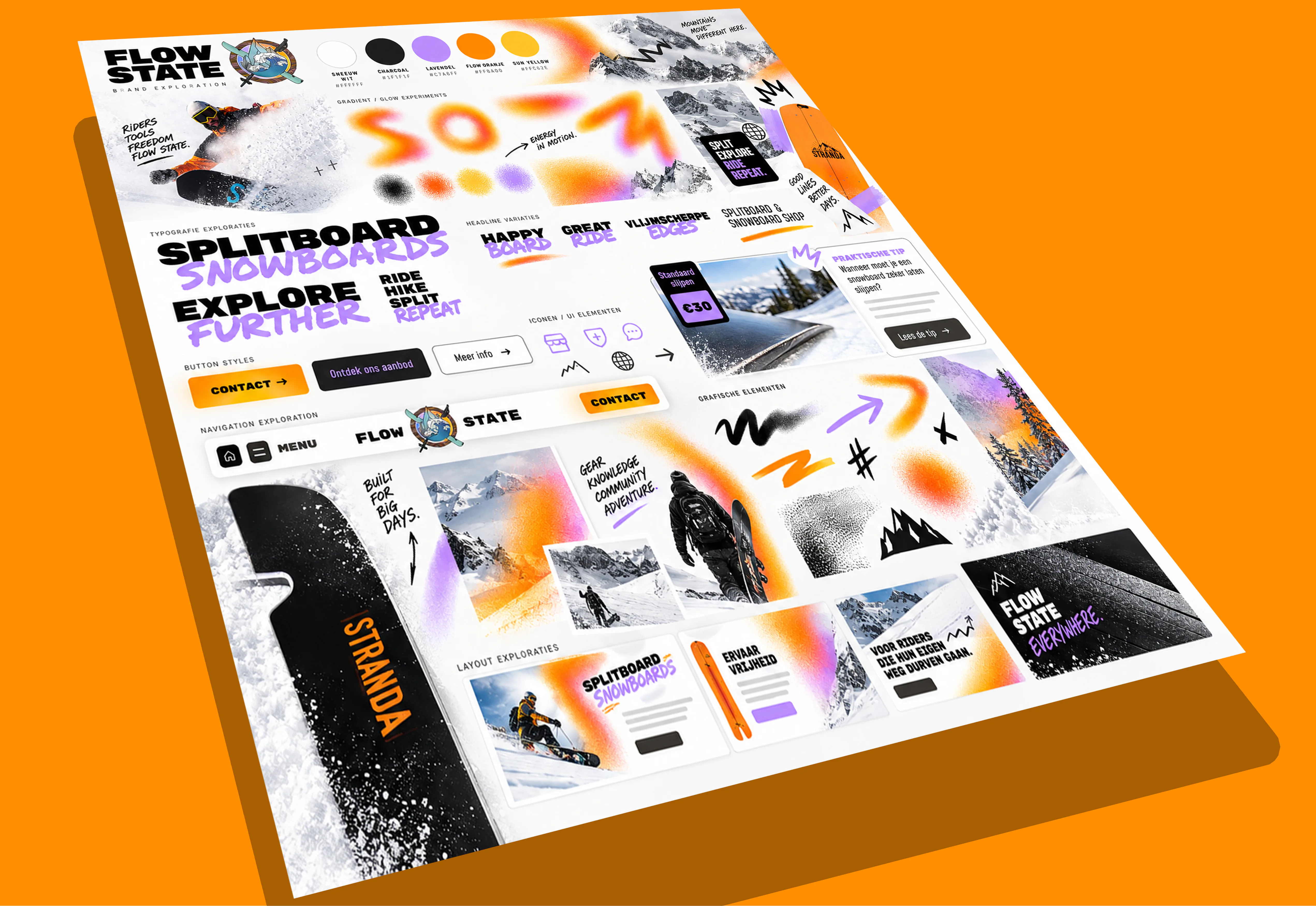
We looked at what makes the logo so attractive and created a matching visual style that feels rebellious, energetic and clear.
We then rebuilt the website from the ground up, starting with the structure and content. Because Flow State didn't want a real webshop, we added a custom overlay for each baord that lets people inspect the board and easily reserve it for pickup.
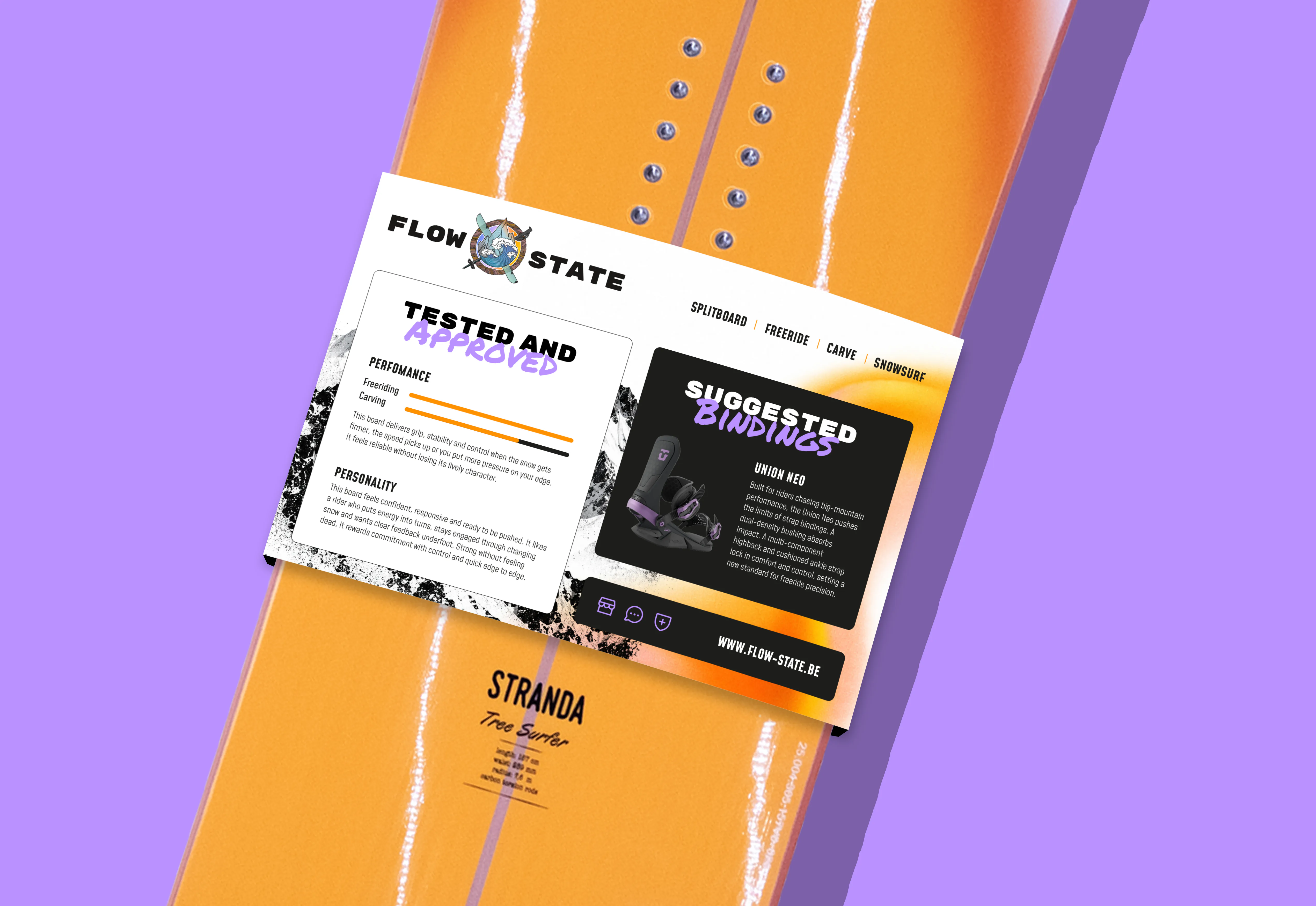
To make the real world customer experience just as exciting as the website we created matching window stickers, in-store materials such as a board sleeve and an eye-catching event setup.
THE PAYOFF
Kind words from our client

Brandstoked understood very quickly what Flow State needed and where the old website was holding us back. The new look feels much closer to who we are and gives customers a much clearer way to discover our boards and services.
What I appreciated most was that the process stayed practical, personal and focused on what would actually benefit the shop. The result feels professional without losing the character that makes Flow State different from mainstream shops.